Starting on a clean slate
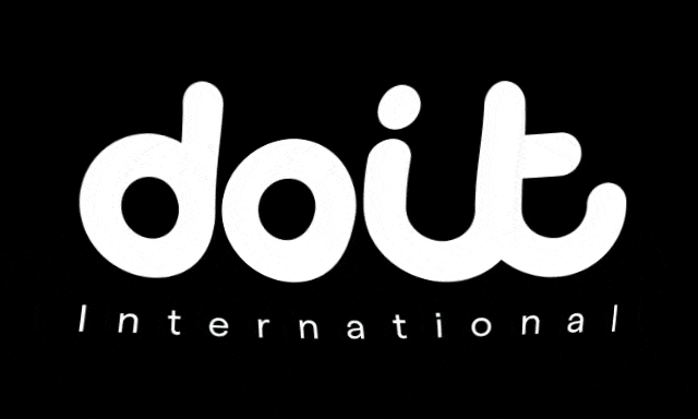
In early 2021, the cloud-based technology service doit international wanted to start again with its brand. A new logo was required, along with a complete brand identity to head the digital environments. I had won the pitch to undertake the rebrand, working in partnership with Colleen Maloney – Head of Content and Communications at DoiT International.
Strategic Thinking
I couldn’t start designing THE logo before considering doit’s place in the cloud technology world – what distinguished it from other companies? I saw that it provided hugely popular content that brought all sorts of companies together to help harness public cloud technology and services to achieve big goals.
Design of the Logo
I now had a starting point for the logo design process. I wanted the logo to fuse with imagery rather than ‘badge’ it. The logo becomes an intriguing and enjoyable addition to the doit imagery.
The outcome
I believe that the doit brand feels both mainstream and shows high quality. The logo is a fresh, contemporary brand, which would encourage people to continue enjoying the content. Doit International is a fast-growing, digitally savvy company that works around the world to help harness public cloud technology and services to achieve big goals. I feel that the new Logo will help deliver the message.
Fields of Activity
-
Website
-
Print
-
Merchandise
-
Product Design
-
Marketing Design
-
Social Media Design
Software I Used
-
Adobe InDesign
-
Adobe Photoshop
-
Adobe Illustrator
-
Adobe Acrobat
-
Brain
-
Sketch Book